Clearer Paths, Better Conversions: My Design Contributions to Greater's Website
Contributing to a creative agency comes with high standards, especially early in a design career. Rather than letting experience gaps slow me down, I focused on bringing grounded, practical ideas to the table. In this case study, I break down the thought process behind the design solutions I contributed at Greater.


Introduction
At Greater, the experience team actively updates our internal website not just to follow annual design trends, but to continually improve conversion rates, lead generation, and page performance every quarter. In this case study, I walk through my specific contributions to this initiative, focusing on the navigation menu and hero section redesigns, and the practical thought process behind each decision.
Gathering References and Ideas
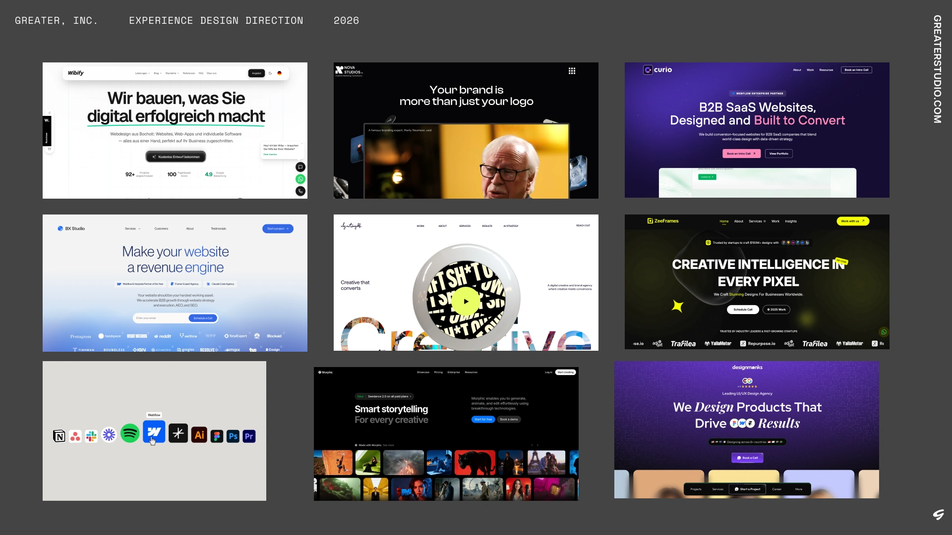
My process always begins with dissecting the core request. For this project, the goal was introducing a slide-out menu bar within the existing primary navigation. Around this time, Greater had secured an OSMO resource access for our team to study how libraries like Barba.js affect page transitions and performance. Instead of treating that tool as an isolated experiment, I used it to study interaction patterns, prioritizing internal agency references and existing technical setups before looking outward.
To keep references relevant, I grounded my research in the business context:
- Competitive Analysis: I analyzed direct and indirect agency competitors to spot familiar UI patterns and opportunities for visual distinction.
- Stakeholder Constraints: Greater’s leadership wanted to clean up the navigation by tucking secondary links into a menu bar without lowering conversion rates or burying key call-to-action touchpoints.
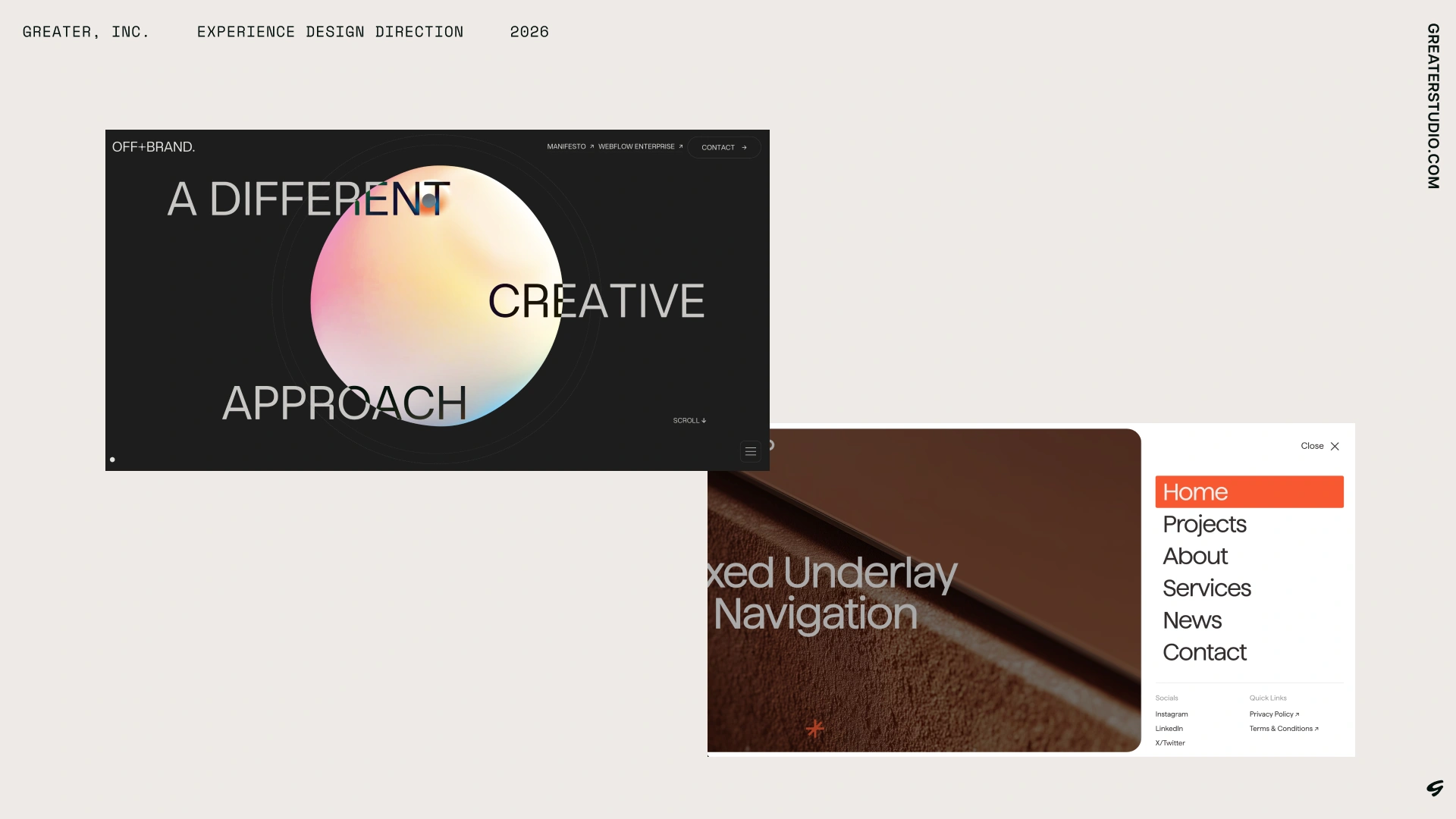
The First Pass
I presented two distinct directions to leadership:
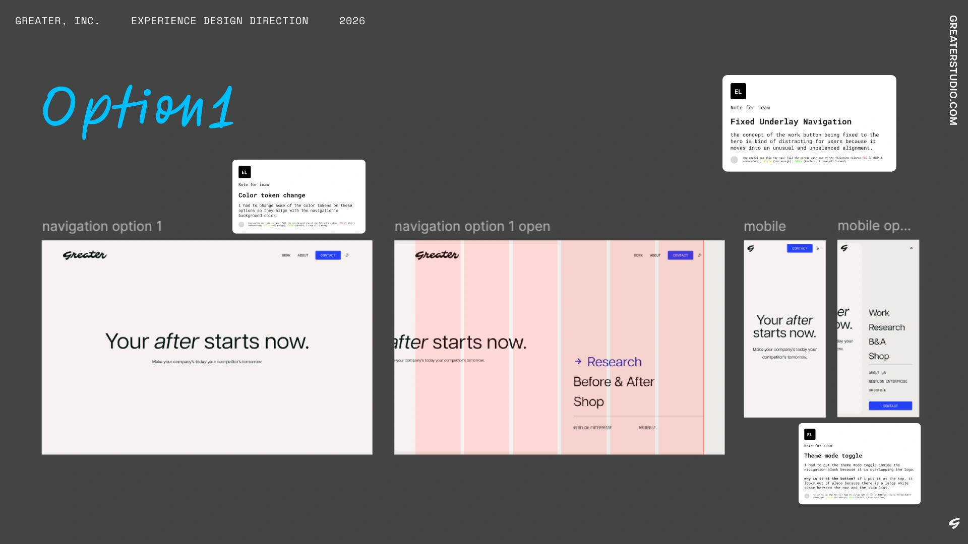
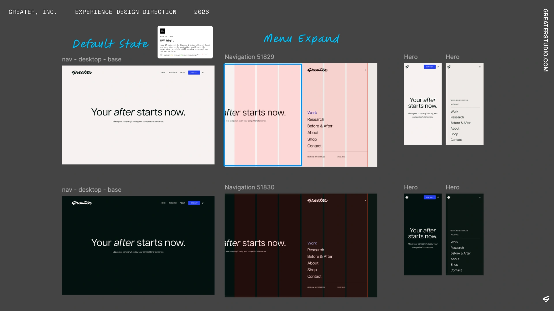
- Option 1 (Split-Screen Drawer): Inspired by OSMO’s fluid interaction style, this approach introduced a right-side drawer that kept the underlying page partially visible on the left. To protect conversion rates, I kept two priority action links visible in the persistent navbar right next to the menu toggle. Structurally, this separate layout block worked seamlessly with Barba.js transition containers.
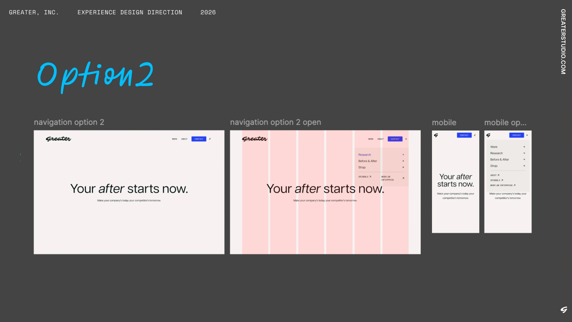
- Option 2 (Compact Dropdown): Drawing from competitor references, this was a more direct, lightweight alternative. It occupied far less viewport space, delivering a fast, low-friction interaction that organized secondary links cleanly.
Iteration and Feedback
Leadership aligned with the structural approach of Option 1 while providing specific design system feedback:
"So I think I like this option (Option 1) the best in terms of animation. I think when we think about the color, I would prefer if we can keep it grayscale as it'll be less jarring when someone is toggling light/dark mode. So if the main UI is dark, the menu is a tad lighter when it opens, matching the color scales that we have across tints and shades.
Additionally, I do like the lower menu elements that deprioritize certain things in a sort of 'tertiary nav'. Let's see what links could be moved into this space in the immediate future and in the long term."
— Jonathan Bach, Partner
First Phase Handoff
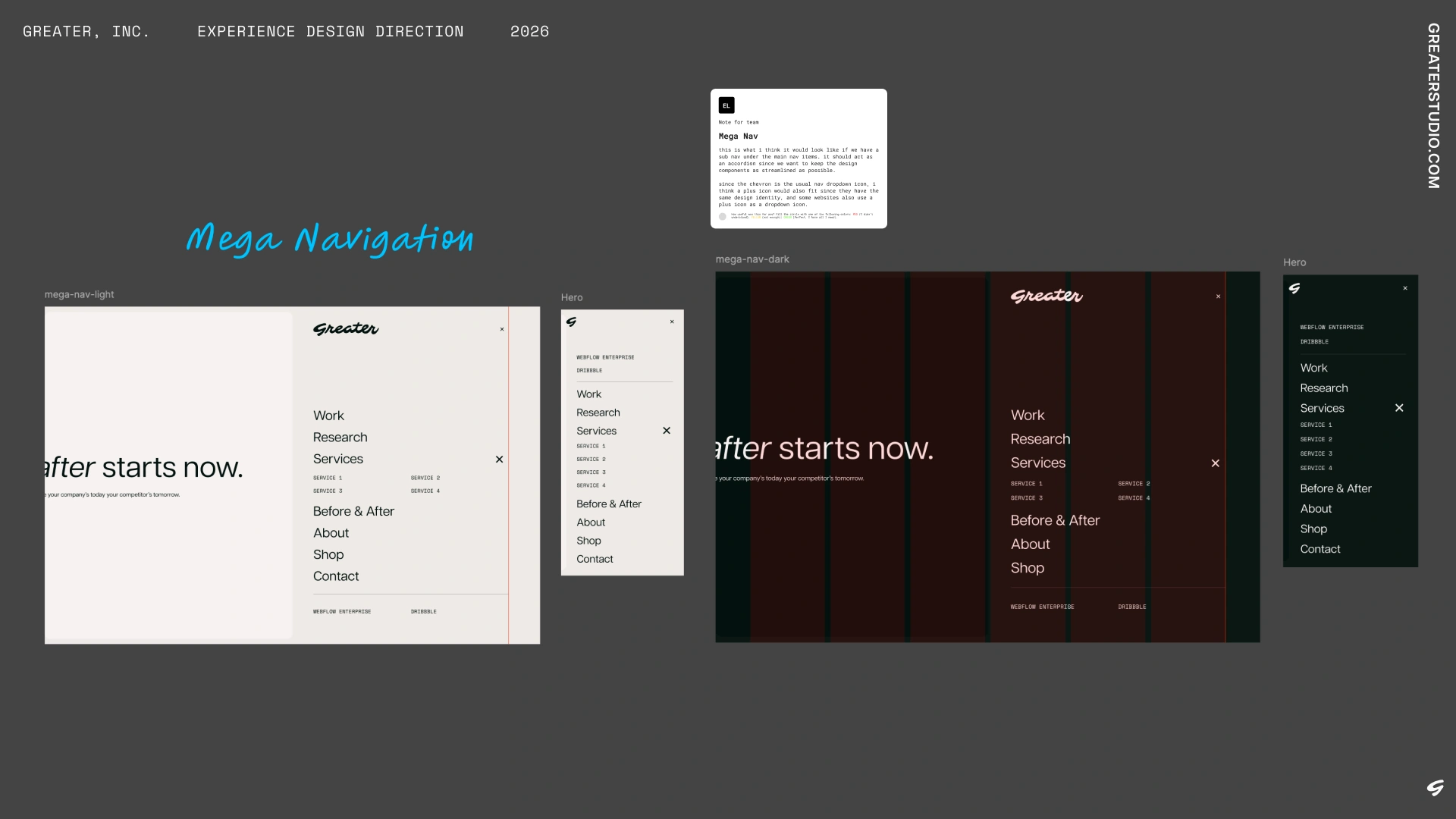
For the initial release, I refined the drawer into a clean mega-navigation pattern:
- Information Architecture: Structured primary links prominently while grouping utility and archive links into the lower tertiary area requested by leadership.
- Color System Alignment: Applied grayscale tints and shades to ensure the background contrast shifted smoothly across light and dark modes.
- Mobile Ergonomics: Shifted the navigation list toward the bottom of the screen on mobile viewports, placing links within natural thumb reach.
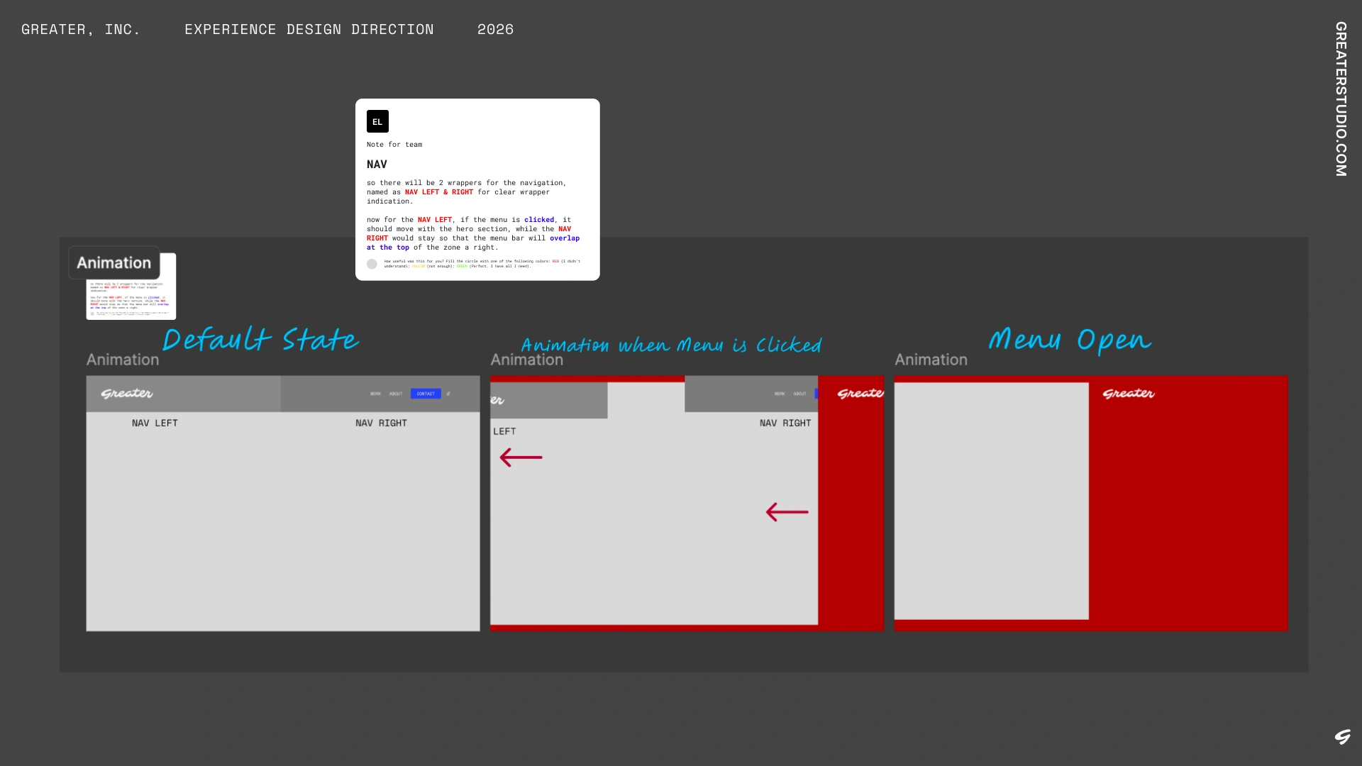
- Developer Handoff: Provided step-by-step animation specs and interaction notes so the development team could implement transitions cleanly.
Hero Redesign
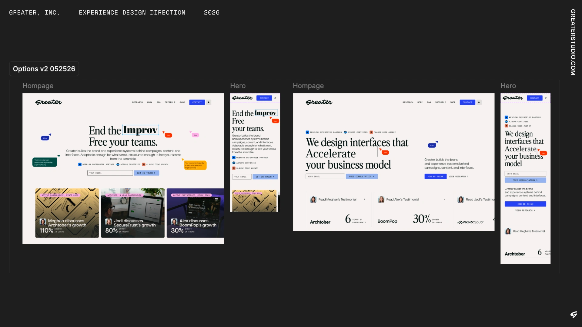
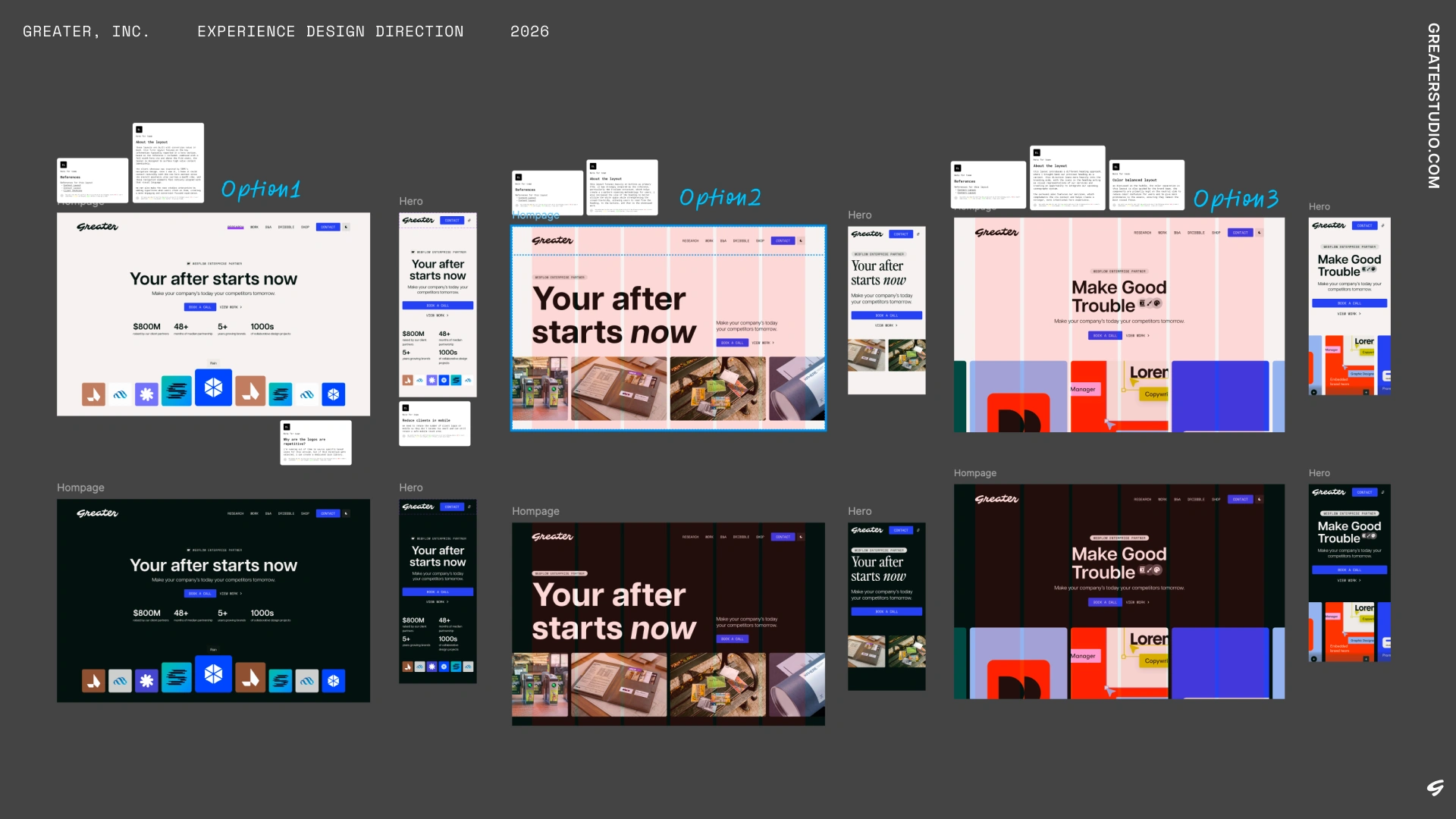
Following the navigation overhaul, I applied the same structured approach to redesigning Greater’s homepage hero section. The goal was to establish clear visual hierarchy, highlight agency credibility above the fold, and test multiple conversion strategies.
Explorations & Directions
- Option 1 (Proof & Stats-Led): Built around early credibility and immediate value. This layout surfaced above-the-fold impact statistics and featured a full-width call to action. For the client work showcase, I drew inspiration from OSMO’s desktop-style UI patterns, incorporating a subtle macOS-inspired visual aesthetic where case study cards doubled as direct, clickable pathways into project deep dives.
- Option 2 (Z-Pattern & Dual CTAs): A two-column structure designed for natural eye tracking. By pairing an expanded headline with primary action buttons on the left and featured visual work on the right, this option established a classic Z-pattern scanning flow: headline → action buttons → showcased work.
- Option 3 (Brand-Led & Iconography): A brand-focused variant incorporating custom service icons directly within the display typography. To support the heading, this layout paired the primary CTA with a horizontal service carousel, offering an early preview of our capabilities right at the top of the page.
Color System & Contrast Balance
Across all variations, component backgrounds and containers were kept strictly neutral, aligned with guidelines from the brand team. Keeping structural UI elements desaturated prevented visual clutter, supported light/dark themes, and allowed featured client imagery and video assets to command the primary visual focus.
Feedback & Synthesis
During our review sync, Jonathan and Monika validated the strategic intent behind each direction. While they appreciated the direct conversion elements of Option 1 and the structural scanning of Option 2, they shared specific layout adjustments to better balance agency positioning with immediate case study visibility.
First Phase Handoff
For the final production pass, I synthesized the strongest elements from the review:
- Hybrid Hierarchy: Combined Option 2’s clear typographic weight and Z-pattern scanning with Option 1’s clickable showcase cards.
- Above-the-Fold Proof: Positioned key project anchors and social proof high enough in the viewport to engage visitors before the first scroll.
- Responsive Refinement: Stacked columns cleanly for mobile viewports, prioritizing the core value proposition and primary contact link before flowing into visual project previews.